

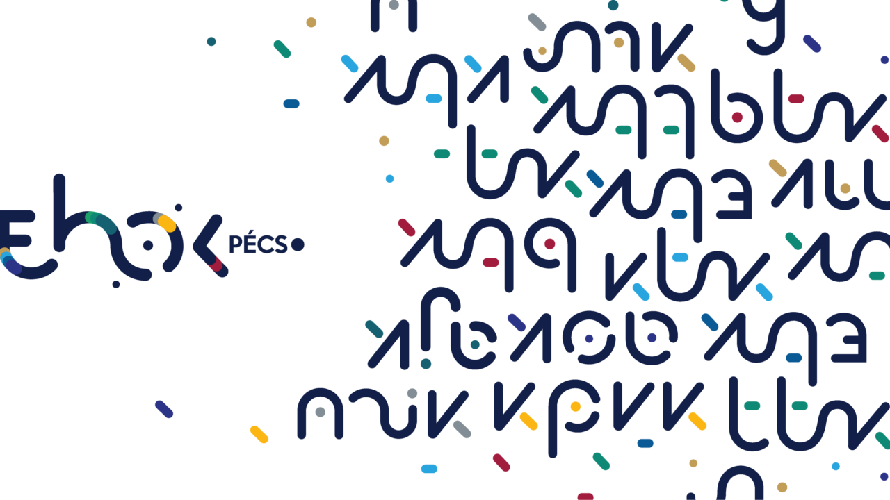
The University Student Union (EHÖK) of the University of Pécs and the ten faculty student unions are moving forward with a new visual identity and a unified logo family. This is the first time that EHÖK and all of the faculty student unions appear within a shared visual identity system. The aim of the redesign was to give the student unions a common visual system that aligns with the University of Pécs's branding, while also allowing each faculty's distinctive character to shine through.
The EHÖK Logo Was the Starting Point
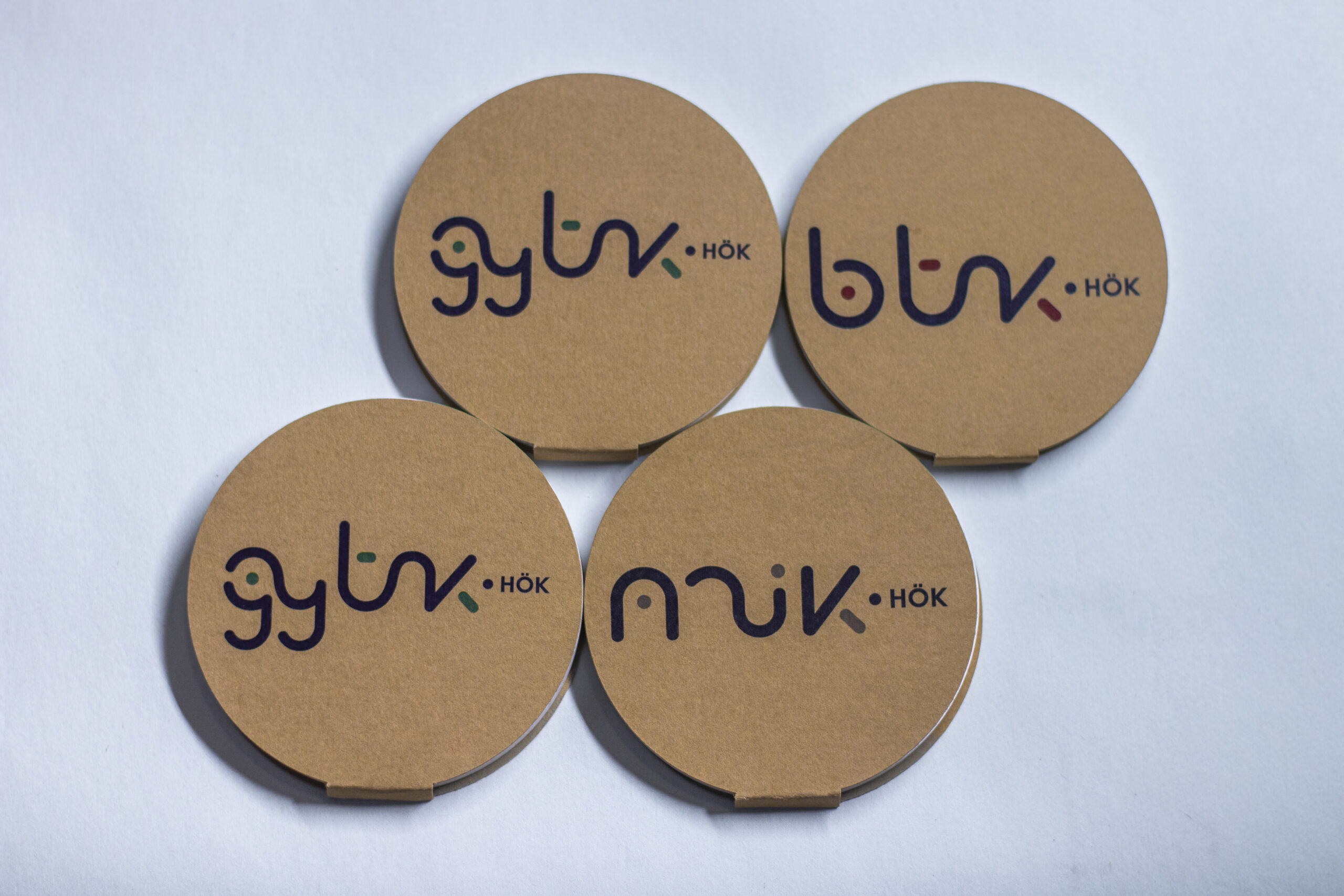
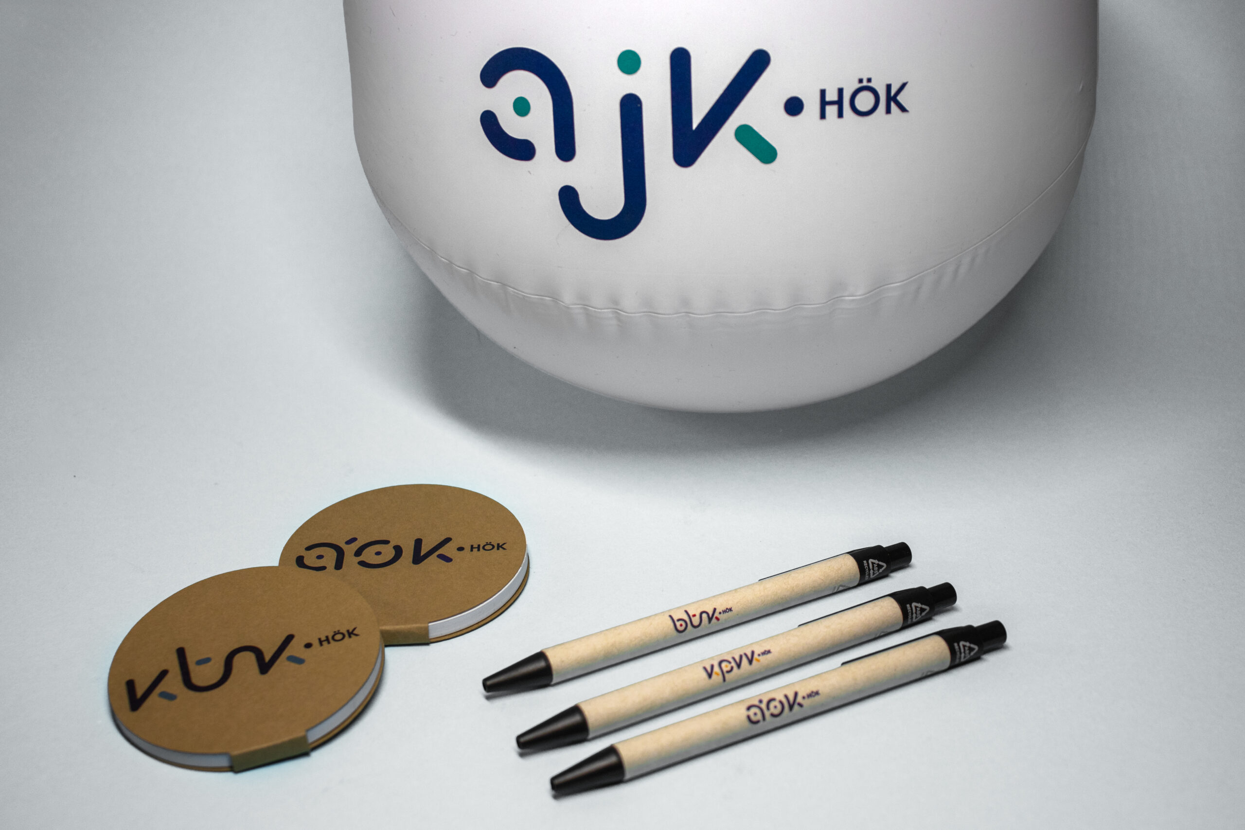
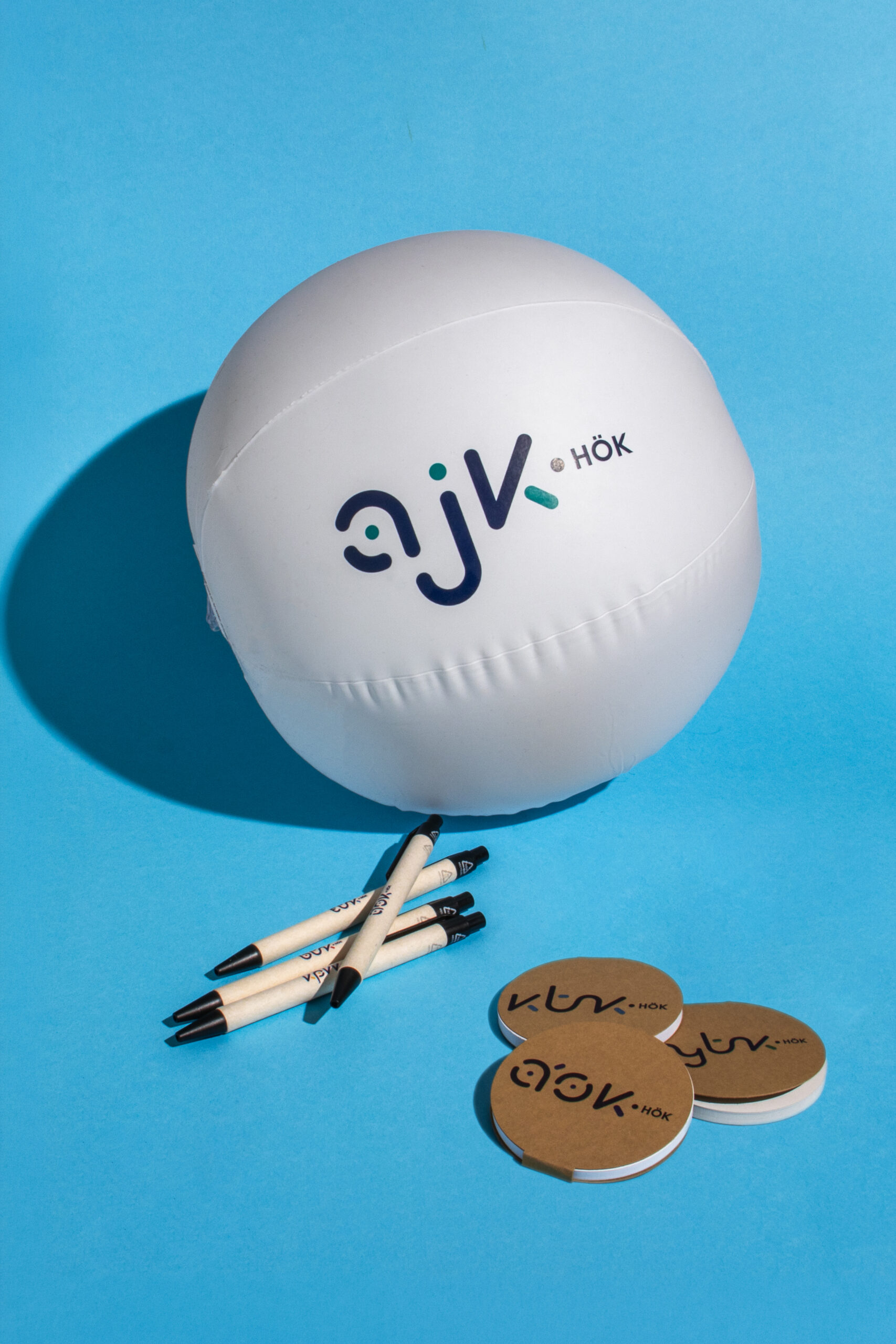
The logo family is built on the existing PTE EHÖK logo. All ten faculty logos carry on its visual language, while the faculty colours give each student union its own character. The identity was designed to work equally well on social media, in printed publications, and at events.
The new logos were designed by graphic designer Krisztina Nagy, a staff member of the Student Services Centre and an alumna of the Faculty of Music and Visual Arts of the University of Pécs. The EHÖK logo that served as the starting point is also her work.
“One of the most important considerations in designing the new logos was to visually express the sense of belonging between the university, EHÖK, and the faculty student unions. Accordingly, I created a unified visual language that is built on common foundations for every faculty and is in harmony with the elements of the existing EHÖK logo, while still leaving room for the expression of individual identity. The use of colour reinforces this as well: every logo retains the shared colour representing unity, while the second colour varies by faculty, reflecting the distinct character and recognisability of each community. An important goal was for the logos to be easily recognisable, modern, and timeless all at once, and to work well on both digital and printed surfaces. The dynamic forms, connected in places by continuous, flowing lines, also carry motifs of togetherness within each individual logo.”
Part of a Longer Process
For EHÖK, the renewed visual identity is part of a longer organisational development process. The unified appearance is expected to make it easier for students to recognise the student unions, while the faculty student unions retain their own identities.
According to Dr. Dominik Horváth, President of the PTE EHÖK, the new logo family clearly reflects the direction the student union intends to pursue in the coming years.
“In my presidential programme, I set out the creation of a more unified, more transparently operating student union system that is easier for students to identify as an important goal. The renewal of our shared visual identity is part of this. We wanted the PTE EHÖK and the faculty student unions to appear visually as parts of the same community, while each faculty’s own identity is preserved. I trust that this new visual identity will not only make our communication more cohesive, but will also further strengthen the cooperation between the student unions.”
The student unions will begin using the new logos on 23 July, the day of the Pont Ott Parti, and over the coming period they will gradually appear across all online and offline platforms.